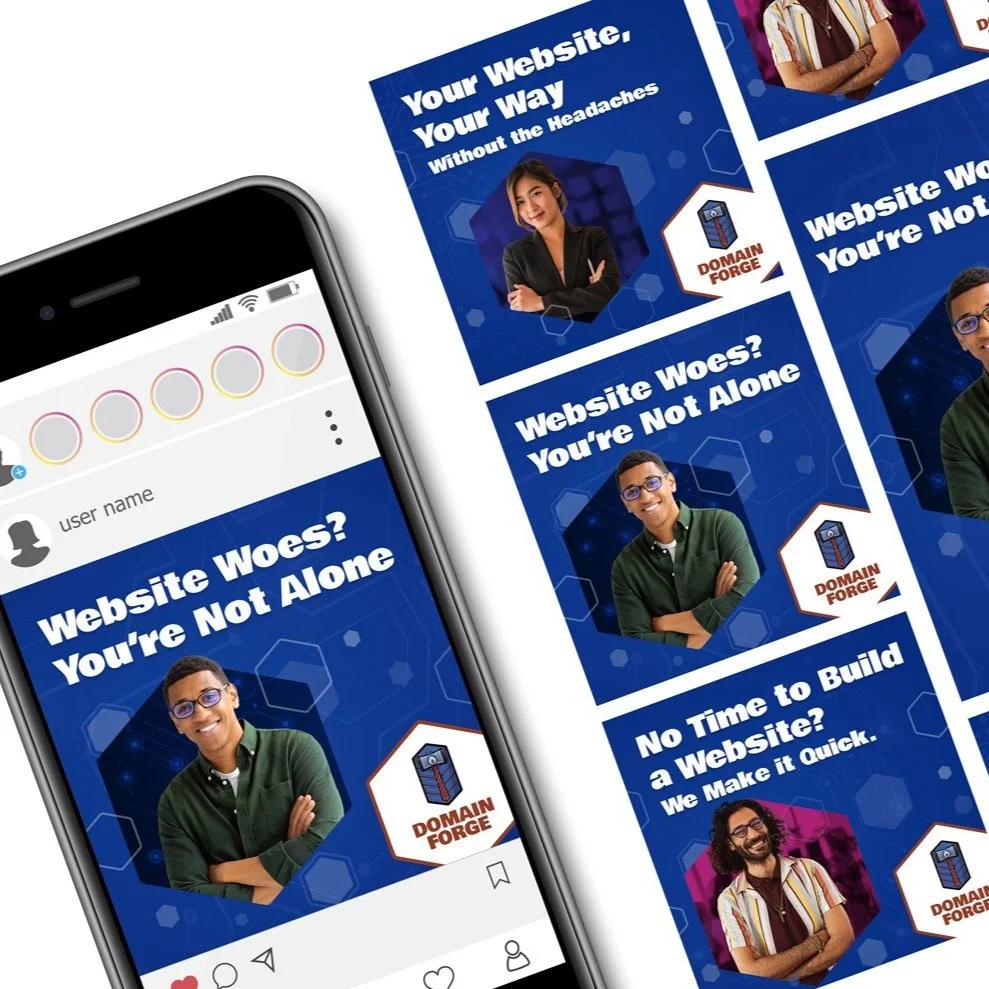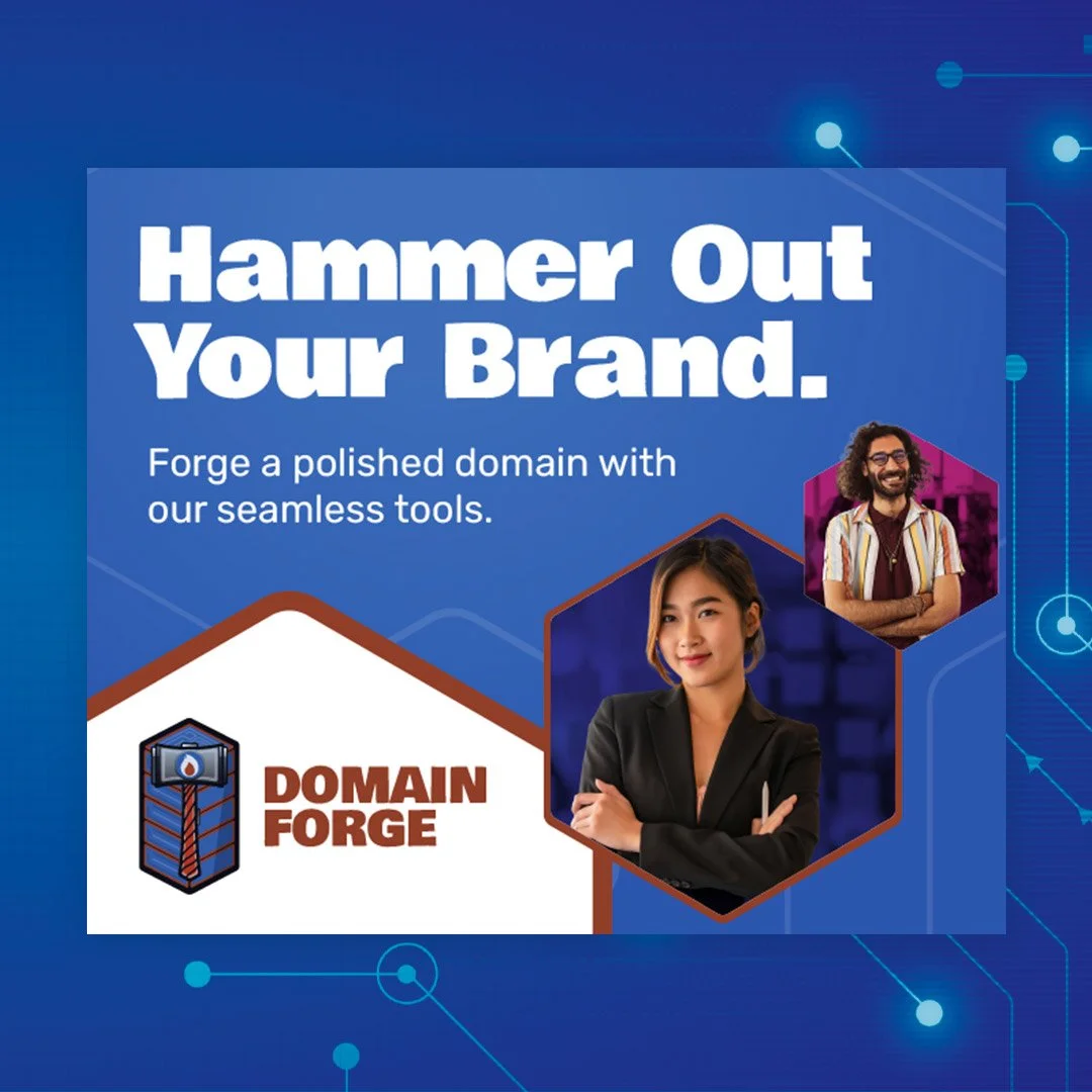
This is a series of web banner ads, along with an email campaign and a landing page designed and proposed to extend the Domain Forge brand.
For the emails, ADA compliancy and accessibility were a top priority; This is achieved through use of high contrast color, legible typography and use of system fonts to be read across multiple email clients. Information needed to be broken up into an easy to digest format and stay legible across light and dark mode settings.
The web banner ads needed a clear and concise CTA that would need to be large enough to be easily tappable on mobile and smaller screens.
Mockup of Landing page on mobile:
https://www.figma.com/proto/9H92Y3bqY2xcdGIO4GcTr9/Untitled?node-id=0-1&t=rK4Bu6fuTKFGXqYt-1
I created this motion design piece as part of a promotional campaign for our OnSmart inventory and mobile platform. The goal was to craft a dynamic, engaging visual experience that would resonate with viewers across digital transit media. This project involved blending creative storytelling with motion graphics to capture attention, convey the brand message effectively, and enhance user interaction with our platform.
Savvy Spirits – A User-Centered Approach to Cocktail Discovery
Savvy Spirits is a desktop and mobile application designed with a modern, intuitive, and sophisticated interface that welcomes all users—from cocktail enthusiasts to casual mixers. Backed by a cloud-based solution, the platform enables users to create, save, and share their favorite cocktail recipes effortlessly.
User-Centered Navigation & Engagement
The home page is designed to provide a seamless browsing experience, featuring curated category suggestions to inspire users. A dynamic user feed showcases the newest cocktail recipes, trending drinks, and a personalized section for previously viewed recipes—ensuring an engaging and efficient discovery process.
Personalized User Experience
The user dashboard serves as a central hub for organizing and managing saved recipes. Users can:
Create and categorize their own collections for easy access.
Submit and share new cocktail recipes with the Savvy Spirits community.
View, save, and share recipes from other users while maintaining full control over their own content.
Strategic Monetization & Brand Integration
To enhance user experience while creating monetization opportunities, the platform seamlessly integrates brand sponsorships through curated recommendations, suggested ingredients, and in-app product placements—offering value to both users and partners.
By prioritizing user experience (UX) and seamless functionality (UI), Savvy Spirits delivers an engaging, easy-to-navigate platform that makes cocktail creation and discovery both fun and accessible.
A proposed campaign for Spirit Halloween Stores aimed at reconnecting audiences with the excitement of the season. After the disruption of routines caused by the pandemic, many missed out on the traditions that make Halloween special. This campaign sought to reignite that festive spirit by engaging users across digital and social platforms.
Strategic digital ads across web and mobile directed users to their nearest Spirit Halloween location, while social media served as an interactive hub—featuring DIY makeup tutorials, user-generated content, and the #HalloweenSpirit movement to foster community engagement. A highlight of this project was the opportunity to integrate custom illustrations, adding a unique and visually compelling element to the campaign.
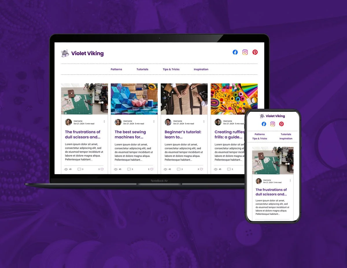
Violet Viking is a blog that chronicles owner and author Rebekah Rothe’s journey through the world of sewing, with a focus on educating, inspiring, and empowering others. To create a platform that effectively supports her mission, we approached the design process through a user-centered lens—prioritizing both content accessibility and future growth opportunities.
Through stakeholder consultations and competitive research, we identified key audience needs: intuitive navigation, clear content categorization, and the ability to engage with posts through comments and social sharing. Additionally, the platform needed to accommodate potential ad placements for future sponsorship opportunities.
To enhance user experience, the blog was structured via post categories—ranging from sewing tips and tutorials to personal insights—this ensures that readers can efficiently find and engage with content relevant to their interests.
Design mockups of the homepage and article pages were created, incorporating a clean and functional layout that balances storytelling with usability. By integrating thoughtful content organization and a scalable design system, Violet Viking is positioned to grow while maintaining a seamless and engaging user experience.
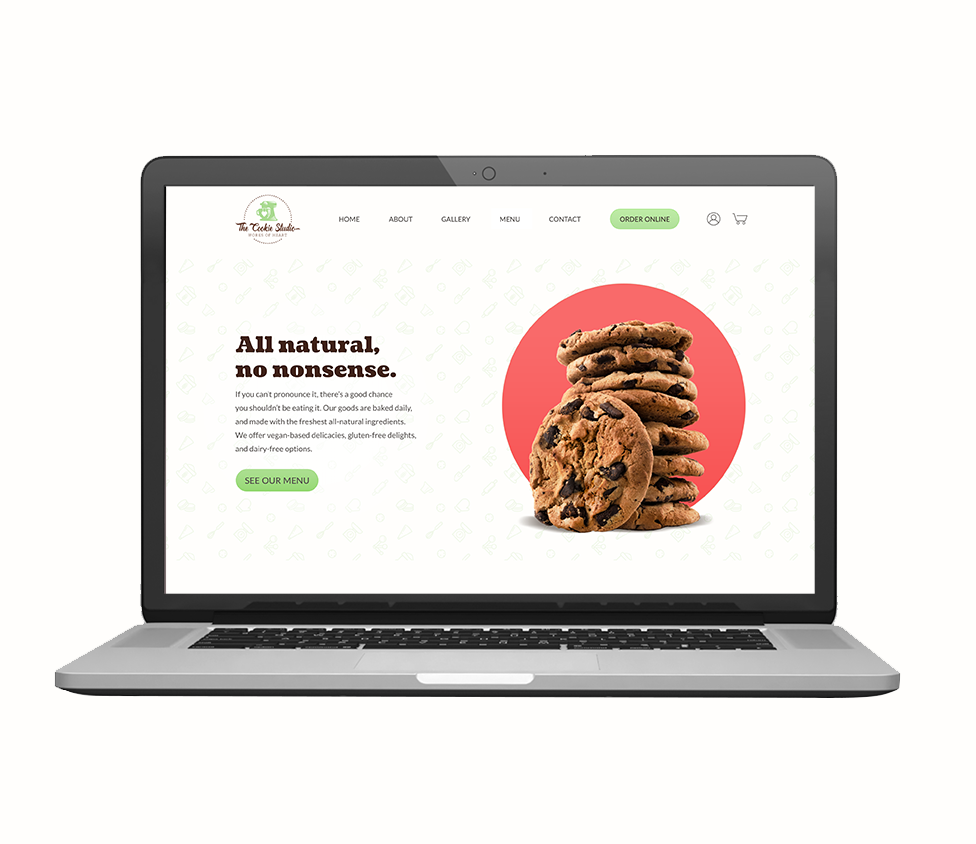
The Cookie Studio is a bakery that specializes in creating all-natural, homemade cookies that bring back the warmth and nostalgia of homemade treats. This identity and brand guide captures the essence of the bakery’s commitment to wholesome ingredients and nostalgic comfort. The design elements, from color palette to typography, are carefully crafted to reflect the bakery’s dedication to natural ingredients and the timeless joy of freshly baked cookies.
Color Palette
The color palette draws inspiration from the earthy, wholesome ingredients used in The Cookie Studio’s cookies. Soft, warm browns echo the rich, golden hues of freshly baked cookies, while gentle creams and light greens symbolize the bakery’s use of natural, organic ingredients. These colors not only communicate the authenticity and quality of the products but also evoke the sense of comfort and nostalgia, reminding customers of simpler times when mom used to bake cookies from scratch in the kitchen.
Typography
The typography reflects the bakery’s friendly, approachable nature. Soft, rounded fonts give a sense of familiarity and warmth, bringing out the cozy, homemade feeling that The Cookie Studio stands for. The typography strikes the perfect balance between modern simplicity and classic comfort, inviting customers into a space that feels like home.
Photography Style
The brand guide also emphasizes the importance of authentic, warm photography. Each photo captures the texture and warmth of the freshly baked cookies, highlighting the natural beauty of the ingredients and the joy of enjoying a homemade treat. The photography style evokes a sense of nostalgia, inviting customers to relive the memories of good times spent in the kitchen with family.
The Cookie Studio’s brand identity is built around the idea of wholesome indulgence, where every bite of a cookie is a taste of love, quality, and tradition. This guide serves as a blueprint for creating a visual identity that aligns with the bakery’s mission to offer delicious, natural treats while connecting customers to the fond memories of homemade goodness.
The Cookie Studio is branching out in the online world. They are building an e-commerce site to boost sales, enabling users to view a menu, place orders, and schedule pick up online.
The Project Scope ran roughly 4 weeks, which consisted of researching similar vendors, user surveys of small groups, and providing wireframes, style guide, and a high-fidelity prototype.
Anime Weekend Atlanta: Bringing Out-of-Home to Life with Custom Illustration
For the first time, Anime Weekend Atlanta (AWA) ventured into the world of out-of-home advertising, combining large-format media with custom illustration to capture the energy and excitement of the convention.
With the goal of increasing awareness and driving attendance, we developed a visually striking campaign tailored to AWA’s passionate fanbase. Utilizing handcrafted illustrations, we infused the artwork with the dynamic, vibrant aesthetics of anime culture—ensuring an authentic and engaging connection with the audience.
Strategic placement in high-traffic areas, including transit, digital billboards, and street-level posters, maximized visibility and created an immersive presence beyond traditional digital promotions. This campaign not only elevated AWA’s brand recognition but also reinforced its status as a must-attend event for anime enthusiasts.
Adrian J, a passionate Wildlife Photographer and entrepreneur, has developed an online course designed to educate photographers of all skill levels. To effectively grow her customer base, she is leveraging strategic social media advertising on Instagram and Facebook to drive targeted traffic to a high-converting landing page designed to maximize engagement and lead generation.
The landing page is carefully structured to guide visitors seamlessly through the sales funnel, using clear messaging, persuasive call-to-actions, and an intuitive layout that encourages email opt-ins. By incorporating user testimonials, the design establishes credibility and builds trust, increasing the likelihood of conversions. Additionally, the email opt-in form not only captures leads but also gathers valuable audience insights—allowing for personalized email drip campaigns tailored to user interests, pain points, and learning goals.
Every design element, from color psychology and whitespace balance to strategic content placement, has been optimized to reduce friction, enhance readability, and drive action. This thoughtful approach ensures that visitors are engaged, informed, and smoothly guided toward subscribing to the course, ultimately improving customer acquisition and retention.
Grenier Law, an attorney firm in the D.C market, wanted to let bikers know they have an attorney in their corner if they are injured in a biking-related accident. A compelling layout was put together from several photos, to communicate this. The ad was placed on bike shares around the city to connect to the riders.Grenier Law, a Washington, D.C.-based attorney firm, sought to connect with the local biking community by ensuring riders knew they had legal support in the event of an accident. To effectively communicate this message, we designed a visually compelling ad that strategically combined multiple images to create a strong, relatable narrative.
Placing the ad on bike-share stations throughout the city ensured high visibility among cyclists at key touchpoints, directly aligning with their daily routines. This targeted approach not only increased awareness but also reinforced Grenier Law’s commitment to advocating for the biking community.
Throughout my career, I have had the privilege of assisting local brands and startups in developing their visual identities, with logo design playing a pivotal role in the process.
From initial consultation and discovery to the final design, I have guided each client in defining their unique voice, aesthetic, and brand mark—ensuring a cohesive and impactful presence.
Sweet Reads, a family-owned bookstore, sought to establish a strong online presence that reflects their commitment to quality and authenticity. With a primary audience of young adult female readers (ages 16–28) and a top-performing category in Young Adult Fiction, the goal was to create a brand identity and website that not only attracts visitors but also fosters community engagement.
The project deliverables included a logo, style guide, wireframes, and a high-fidelity prototype for the homepage. A key feature of the site was the integration of Sweet Reads’ Instagram feed to encourage social interaction and enhance brand visibility. Additionally, a book search functionality was incorporated, allowing users to find titles by author or book name, creating a seamless browsing experience. Recognizing the store’s dedication to supporting local authors, the site also highlights author events, meet-and-greets, and book talks, positioning Sweet Reads as a hub for literary engagement within the community.
The design process was informed by market research and user analysis, examining similar independent bookstores and the shopping behaviors of the target demographic. Insights from this research shaped a digital experience that is visually inviting, user-friendly, and optimized for engagement, ensuring that Sweet Reads’ online presence effectively supports its in-store experience and business objectives.
For Gold Rush: Dead Man’s Creek, an Old West-themed card game for players aged 8 and up, I contributed to multiple aspects of the project, including character design, illustration, layout, and logo design. My goal was to bring the rugged, adventurous spirit of the Old West to life through dynamic visuals that capture the essence of the game. By blending detailed character art with thoughtful layout and branding, I helped create an immersive experience that enhances gameplay and resonates with players.
I've been passionate about drawing since I was a child, and it has always served as my creative outlet, providing relaxation and a way to unwind. While I occasionally take on commission work, my true joy lies in creating for myself and sharing my experiments with others. I’m constantly pushing myself to try new techniques, explore different brushes, and experiment with various programs. Whether it's a piece born from inspiration or an opportunity to learn something new, each project is a chance to grow and evolve as an artist. Here are some examples of my work, reflecting both my creative journey and my ongoing exploration of new possibilities.